Our Sunnyvale market trend charts below were updated: Apr 30, 2026. We've calculated our unique Sunnyvale trend graphs using all sales records available from MLSListings, the multiple listing service used by nearly all licensed Silicon Valley real estate agents when listing real estate for sale.
Save time and save money. Work with a knowledgeable top Sunnyvale real estate agent.
Apr 30, 2026, current Q2 market statistics for Sunnyvale houses
- Sunnyvale number of houses sold: 21
- Sunnyvale house sale price: $2,556,000 (median) $2,523,222 (average)
- Sunnyvale house price per sqft: $1,638 (median) $1,552 (average)
- Sunnyvale house days on market: 8 (median) 11 (average)
- Sunnyvale sale price to list price for houses: 109%
Effective annual percentage change in median sq.ft. sales price over last:
- 5 years (2021 to 2026): 3.7%
- 10 years (2016 to 2026): 5.8%
Early in the quarter there may not be any closed escrows to report. Effective annual percentage change can not be calculated if there were no sales in one of the years.
Quick 72 Second Comparison of Silicon Valley With Each City
You can watch a quick 72 second comparison of the house price per square foot for each city in Silicon Valley with the Silicon Valley average and median prices on our Silicon Valley real estate trends page.
Most Expensive House In
Sunnyvale
Cheapest House In
Sunnyvale
View all Sunnyvale homes for sale
Recent Sunnyvale Real Estate Trends - highlights we see on 03/17/2026
Over the past three years, Sunnyvale shows a clear upward trend in price per square foot, indicating strong appreciation following the 2022 dip. The overall sale price trend is similar, though slightly more variable due to changes in the mix of homes sold. The size graph suggests that larger homes tend to correspond with lower price per square foot, which helps explain minor differences between total price and per-square-foot trends. The sale-to-list price metrics are notably strong, with a high percentage of homes selling over list and averages well above 100%, indicating buyers are likely to face significant competition and elevated effective purchase prices. Days on market shows a repeating seasonal pattern with first-quarter lows, while the overall level remains very low, reflecting strong demand. The number of sales follows a seasonal pattern, typically with lower activity in the first quarter and higher mid-year, while the broader trend appears relatively flat. Overall, the market is competitive and appreciating, suggesting buyers will continue to face limited negotiating leverage and strong pricing pressure. Compared to the broader Silicon Valley market, Sunnyvale’s price per square foot has risen more sharply and consistently, indicating stronger local appreciation and demand relative to the regional average.
The Trend Graphs Below Were Updated Apr 30, 2026
Introduction To Extensive Sunnyvale Real Estate Market Trends
For most areas, houses are the most common type of home sold. To quickly spot changes in the Sunnyvale real estate market view Sunnyvale house prices per sq.ft. and Sunnyvale house sales price vs. list price. Changes in the mix of houses sold in Sunnyvale can change the average price even when the price per sq.ft. does not change. The sales price vs. list price graph flags changes in demand vs. supply. The numerous other trends graphed help you both understand and compare Sunnyvale real estate to other areas. Recently completed townhouse and condo developments, because of their size, can have significant short term impacts on supply vs. demand for their respective home types but typically do not affect overall Sunnyvale housing supply vs. demand trends.
Jump down to extensive Sunnyvale real estate trends
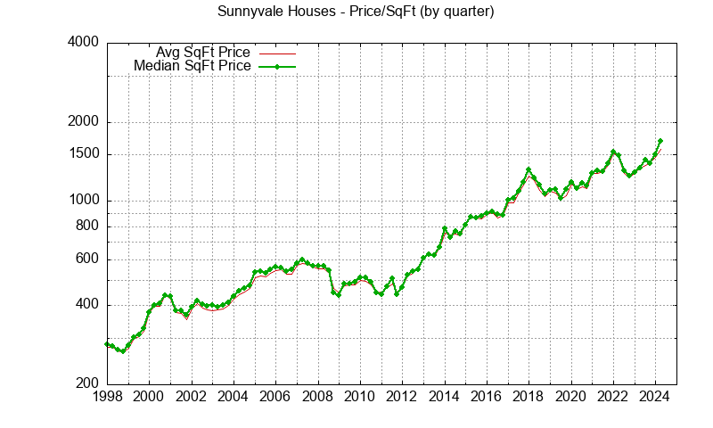
Sunnyvale Real Estate Trends - Houses
Short summary of 4 key Sunnyvale home value trends for single family houses which can be printed
Sunnyvale Real Estate Trends - Average and Median Home Prices Of Houses
When trying to understand Sunnyvale home prices, the first and most often real estate trend looked at is either average sale price or median home sale price. The average price can be pushed up by a particularly expensive home being sold. Much less often an especially low price for several homes can push the average price down. By looking at both average and median home prices, a quick judgment can be made about any unusually high or low prices.


Sunnyvale Real Estate Trends - Home Prices Per Square Foot For Houses
The sales price of a Sunnyvale house is affected by its size. Looking at price per square foot gives a partial adjustment for differences between houses. Furthermore if you look at the average size of a Sunnyvale house sold you will see that it varies with time. Part of the variation is due to the random nature of which houses are being sold but there tends to be a increase in the size with time because when a house is replaced with a newer house, the newer house is almost always larger.


Sunnyvale Real Estate Trends - House Sales Prices vs. List Prices
Home buyers and sellers want to know the typical relationship between list price and sales price. This relationship varies with city and time. The plots below show this relationship for Sunnyvale houses using color coding which generally highlights changes in the market. More Sunnyvale homes being sold over list price is a very good indicator of rising home prices. More homes being sold under list price is a very good indicator of falling home prices.


Sunnyvale Real Estate Trends - Number of Houses Sold
A quick estimate of how active the Sunnyvale real estate market is can be found by looking at the number of houses sold. Locally there is a strong seasonal change in the number of houses sold. The lowest number of houses sold typically occurs around December & January. The highest number of houses sold typically occurs around May. Price changes do not track the seasonal change in the number of houses sold.


Sunnyvale Real Estate Trends - Days On Market for Houses Sold
Many people look at "Days On Market", the average number of days a house is offered for sale before it sells, to spot changes in the Sunnyvale real estate market. Increasing DOM implies buyers are not being as competitive to buy homes. This statistic also tends to have a seasonal variation. DOM is typically greater late in the year. Seasonal variation in this statistic can make it difficult to use this statistic to predict either rising or falling house prices.


Sunnyvale Real Estate Trends - Size of Houses Sold
The behavior of buyers and sellers can be somewhat different depending on the price of the house. There are times when low to mid-range homes are selling quickly but higher priced homes aren't or the reverse may be true. Generally house price is proportional to size in a given area. Locally newer homes are often larger than older homes. Looking at the average size of houses being sold can provide additional insight into the Sunnyvale real estate market.


Sunnyvale Real Estate Trends - Lot Size of Houses Sold
As mentioned above generally house price is proportional to house size in a given area. Another factor is lot size. Most local cities limit the maximum size of house that can be built depending upon the lot size. A larger house can be built on a larger lot. Additionally local cities may allow a secondary dwelling if the lot is greater than a specified size (typically 8,000 sf).
Looking at the average lot size of houses being sold can provide additional insight into the Sunnyvale real estate market. Lot sizes over 150,000 sf are excluded from the statistics to prevent the uncommon sale from pushing the average much higher than the median.


Sunnyvale Real Estate Trends - Age of Houses Sold
A brand new Sunnyvale home typically sells for a premium price compared to a similar sized home in the same neighborhood. When looking at average Sunnyvale home prices, the average age should be checked to see if prices are changing because of demand or because different types of houses are being sold.


Sunnyvale Home Prices - Maximum and Minimum for Houses Sold
When trying to understand the Sunnyvale real estate market, it is useful to take a look at the extremes of the sales price range. Average buyers and sellers in each price range may act differently.

Quarterly Maximum Sunnyvale Price of Houses Sold

Quarterly Minimum Sunnyvale Price of Houses Sold

Monthly Maximum Sunnyvale Price of Houses Sold

Monthly Minimum Sunnyvale Price of Houses Sold

Yearly Maximum Sunnyvale Price of Houses Sold

Yearly Minimum Sunnyvale Price of Houses Sold
Sunnyvale Real Estate Trends - Townhouses
Short summary of 4 key Sunnyvale real estate trends for townhouses which can be printed.
Most Expensive Townhouse/Condo In
Sunnyvale
Cheapest Townhouse/Condo In
Sunnyvale
Go view all Sunnyvale homes for sale
Sunnyvale Real Estate Trends - Average and Median Townhouse Prices
When trying to understand Sunnyvale townhouse prices the first and most often real estate statistic looked at is either average or median townhouse sale price. The average price can be pushed up by a particularly expensive townhouse being sold. Much less often an especially low price for several townhouses can push the average price down. By looking at both average and median price a quick judgment can be made about any unusually high or low prices. When a townhouse development is offered for sale, the high number of units offered can shift both average and median prices.


Sunnyvale Real Estate Trends - Townhouse Prices Per Square Foot
The average sales price of townhouses is typically affected by the average size of the townhouses sold. If a new development comes up for sale, the average size can be affected which in turn affects the average sales price. This same development may affect statistics a second time about five years later if many of the first purchasers decide to sell and move to a bigger home. Looking at price per square foot gives a partial adjustment for changes in the typical townhouse sold.


Sunnyvale Real Estate Trends - Townhouse Sales Prices vs. List Prices
Sunnyvale townhouse buyers and sellers want to know the typical relationship between list price and sales price. This relationship varies with city and time. The plots below show this relationship using color coding which generally highlights changes in the market. More townhouses being sold over list price is a very good indicator of rising demand for townhouses. More townhouses being sold under list price is a very good indicator of falling townhouse demand. Comparing Sunnyvale townhouse prices to Sunnyvale house prices can give you more insight into whether there is a general change in Sunnyvale home prices or if something unique to townhouses is happening.


Sunnyvale Real Estate Trends - Number of Townhouses Sold
A quick estimate of how active the Sunnyvale townhouse real estate market is can be found by looking at the number of townhouses sold. Locally there is a strong seasonal change in the number of townhouses sold. The lowest number of townhouses sold typically occurs around December & January. The highest number of homes sold typically occurs around May. This seasonal variation is often altered for townhouse sales by a large new development beginning to sell their townhouses. Price changes do not track the seasonal change in the number of townhouses sold.


Sunnyvale Real Estate Trends - Days On Market for Townhouses Sold
Many people look at "Days On Market", the average number of days a townhouse is offered for sale before it sells, to spot changes in the townhouse real estate market. Increasing DOM implies buyers are not being as competitive to buy townhouses. This statistic also tends to have a seasonal variation. DOM is typically greater late in the year. Seasonal variation in this statistic can make it difficult to use this statistic to predict either rising or falling townhouse prices. New townhouse developments can change the typical DOM.


Sunnyvale Real Estate Trends - Size of Townhouses Sold
The behavior of buyers and sellers can be somewhat different depending on the price of the townhouse. There are times when low to mid-range townhouses are selling quickly but higher priced townhouses aren't, or the reverse may be true. Builders try to match what they build to what is selling well. It can take several years for a townhouse development to begin selling but it was surely built to target expected demand. Looking at the average size of townhouses being sold can provide additional insight into the townhouse real estate market.


Sunnyvale Real Estate Trends - Age of Townhouses Sold
A brand new townhouse typically sells for a premium price compared to a similar sized townhouse in the same neighborhood. When looking at average townhouse prices, the average age should be checked to see if prices are changing because of demand or because different types of townhouses are being sold.


Sunnyvale Home Prices - Maximum and Minimum for Townhouses Sold
When trying to understand the Sunnyvale real estate market, it is useful to take a look at the extremes of the sales price range. Average buyers and sellers in each price range may act differently.

Quarterly Maximum Sunnyvale Price of Townhouses Sold

Quarterly Minimum Sunnyvale Price of Townhouses Sold

Monthly Maximum Sunnyvale Price of Townhouses Sold

Monthly Minimum Sunnyvale Price of Townhouses Sold

Yearly Maximum Sunnyvale Price of Townhouses Sold

Yearly Minimum Sunnyvale Price of Townhouses Sold
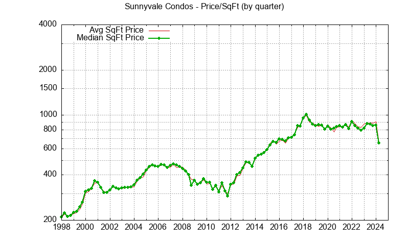
Sunnyvale Real Estate Trends - Condos
Short summary of 4 key Sunnyvale real estate trends for condos which can be printed.
Sunnyvale Real Estate Trends - Average and Median Condo Prices
When trying to understand Sunnyvale condo prices the first and most often real estate statistic looked at is either average or median condo sale price. The average price can be pushed up by a particularly expensive condo being sold. Much less often an especially low price for several condos can push the average price down. By looking at both average and median price a quick judgment can be made about any unusually high or low prices. When a condo development is offered for sale, the high number of units offered can shift both average and median prices.


Sunnyvale Real Estate Trends - Condo Prices Per Square Foot
The average sales price of condos is typically affected by the average size of the condos sold. If a new development comes up for sale, the average size can be affected which in turn affects the average sales price. This same development may affect statistics a second time about five years later if many of the first purchasers decide to sell and move to a bigger home. Looking at price per square foot gives a partial adjustment for changes in the typical condo sold.


Sunnyvale Real Estate Trends - Condo Sales Prices vs. List Prices
Sunnyvale condo buyers and sellers want to know the typical relationship between list price and sales price. This relationship varies with city and time. The plots below show this relationship using color coding which generally highlights changes in the market. More condos being sold over list price is a very good indicator of rising demand for condos. More condos being sold under list price is a very good indicator of falling condo demand. Comparing Sunnyvale condo prices to Sunnyvale house prices can give you more insight into whether there is a general change in Sunnyvale home prices or if something unique to condos is happening.


Sunnyvale Real Estate Trends - Number of Condos Sold
A quick estimate of how active the Sunnyvale condo real estate market is can be found by looking at the number of condos sold. Locally there is a strong seasonal change in the number of condos sold. The lowest number of condos sold typically occurs around December & January. The highest number of homes sold typically occurs around May. This seasonal variation is often altered for condo sales by a large new development beginning to sell their condos. Price changes do not track the seasonal change in the number of condos sold.


Sunnyvale Real Estate Trends - Days On Market for Condos Sold
Many people look at "Days On Market", the average number of days a condo is offered for sale before it sells, to spot changes in the condo real estate market. Increasing DOM implies buyers are not being as competitive to buy condos. This statistic also tends to have a seasonal variation. DOM is typically greater late in the year. Seasonal variation in this statistic can make it difficult to use this statistic to predict either rising or falling condo prices. New condo developments can change the typical DOM.


Sunnyvale Real Estate Trends - Size of Condos Sold
The behavior of buyers and sellers can be somewhat different depending on the price of the condo. There are times when low to mid-range condos are selling quickly but higher priced condos aren't, or the reverse may be true. Builders try to match what they build to what is selling well. It can take several years for a condo development to begin selling but it was surely built to target expected demand. Looking at the average size of condos being sold can provide additional insight into the condo real estate market.


Sunnyvale Real Estate Trends - Age of Condos Sold
A brand new condo typically sells for a premium price compared to a similar sized condo in the same neighborhood. When looking at average condo prices, the average age should be checked to see if prices are changing because of demand or because different types of condos are being sold.


Sunnyvale Home Prices - Maximum and Minimum for Condos Sold
When trying to understand the Sunnyvale real estate market, it is useful to take a look at the extremes of the sales price range. Average buyers and sellers in each price range may act differently.

Quarterly Maximum Sunnyvale Price of Condos Sold

Quarterly Minimum Sunnyvale Price of Condos Sold

Monthly Maximum Sunnyvale Price of Condos Sold

Monthly Minimum Sunnyvale Price of Condos Sold

Yearly Maximum Sunnyvale Price of Condos Sold

Yearly Minimum Sunnyvale Price of Condos Sold
Use The Best Sunnyvale Realtor
Save both your time and money by working with the best Sunnyvale Realtor. The number 1 reason home buyers choose to work with a real estate agent is to get help "finding" the best home. Up to date knowledge and connections are key to finding the best home. However, there is much more involved than finding the home. After finding the best home, you will have to make the most attractive, competitive, offer. It is important to know that factors other than just money play a key part in the seller's decision. You will have to resolve any problems that pop-up so that escrow can close.
I negotiate over one hundred successful purchase offers each year. I have up-to-date experience and knowledge to plan and make a great offer. What if something goes wrong with your loan application or with something else? We at JLee Realty have the experience and connections to solve nearly all problems. Work with us, the best Sunnyvale real estate agents. We know Sunnyvale very well AND we know other nearby Silicon Valley cities. For 3 years in a row I was recognized as one of the three top, and most recently as the number 1 top Realtor nationwide at KW. The Juliana Lee Team has grown beyond what KW can provide and I now own and operate my own real estate brokerage for my team: JLee Realty, 4260 El Camino Real, Palo Alto CA 94306.
Our unique team approach splits up the various tasks when buying a home. You will work with both myself and a core member of the Juliana Lee Team who is also a top real estate agent. My buyer team specialist is especially skilled at helping you both find a home and to understand the tradeoffs you will be making. I discuss your purchase offer with you and negotiate with the seller. Get the support of two top Sunnyvale Realtors (and the rest of our team) working closely together. Give us, the Juliana Lee Team, a call at 650-857-1000 or stop by our brokerage, JLee Realty, and let's talk about what you are looking for.
So far I've talked about buying real estate because it is not as well understood by home buyers as selling real estate is. When selling your home, it has to be advertised. It has to be promoted. The Juliana Lee Team has one of the most prominent real estate websites in Silicon Valley. It rates highly for key real estate terms in 35 Silicon Valley cities. If a home buyer searches for real estate trends or house prices in a Silicon Valley city, they will almost surely find julianalee.com on the first page of Google search results. In fact searching for "Silicon Valley real estate trends" will probably return julianalee.com in the first position or at least in a one of the first three. Similarly searching for "Palo Alto real estate trends" will probably return julianalee.com in one of the first three positions. We achieve similar excellent search results for nearly all Silicon Valley cities. We know how to promote successfully both digitally and in print.
Of course there is much more involved to sell your home than simply advertising it. The Juliana Lee team at JLee Realty has both a buyer team and a seller team. Our seller team gets current knowledge about what buyers are looking for from our buyer team. Our seller team also gets current knowledge about what problems buyers are currently facing and how the problems are minimized. If a buyer makes an offer to buy your home but runs into problems getting a loan, we can help with expert current advice. Since our buyer team gets potential buyers from our seller team, they want our seller team to be successful and knowledgeable about issues buyers are facing. Our buyer team can represent buyers while our seller team can represent sellers without a conflict of interest or loyalty.
Have you ever wondered what the difference is between a Sunnyvale real estate agent and a Sunnyvale Realtor? "Realtor" is a trademarked name owned by the National Association of Realtors (NAR). A Sunnyvale Realtor is a real estate agent who belongs to NAR. Many purchase contract forms used locally are created by the California Association of Realtors (CAR) which is under NAR. The local Silicon Valley Association of Realtors (SILVAR), the Santa Clara County Association of Realtors (SCCOAR) and San Mateo County Association of Realtors (SAMCAR) manage access to the multiple listing service and establish standards of practice for local real estate agents.
If you want to learn more about buying or selling real estate, come to our free real estate seminar.
