Real Estate Market Trends
Silicon Valley Real Estate | JLee Realty
- For Sale
- Juliana
- Buying
- Homes For Sale
- Agent Commission
- Should I Buy A Home Now
- Preemptive Offer
- Buyer Endorsements
- Buy & Sell At Same Time
- Buying A House
- Real Estate Seminar
- Choosing A Buyer Agent
- Closing Escrow
- Contingencies
- Eichler Homes
- 10 Escrow Questions
- FAQ
- Hire The Best
- Home Buying Fears
- Moving Day Checklist
- Negotiating
- New House vs. Old House
- Rent vs. Buy
- Ways To Hold Title
- Wire Fraud
- Zillow
- Selling
- Cities
- City Information
- Real Estate Trends
- Home Values
- Just Sold
- Silicon Valley Trends
- San Mateo County
- Santa Clara County
- Alameda County
- Zip Code Index
- Zip Code Map
- Information
- Airbnb &Vacation Rentals
- Real Estate Contracts
- Real Estate Information
- ADU-Accessory Dwelling Unit
- Agent Designations
- Agent Thank You
- Asbestos
- Avoid Water Damage
- Closing Costs
- Double Ending, Dual Agency
- Escrow Problems
- Flood Zones
- Implied Agency
- Liquefaction
- Mechanics Lien
- Mortgage Information
- Multiple Counter Offer
- New Homes
- Power Lines
- Preemptive Offer
- Property Line Fence Laws
- Property Ownership
- Property Taxes
- Proposition 19
- Real Estate Trends
- Recent Home Sales
- Removing Protected Trees
- Renting Out Condos (CIDs)
- SB 9 - CA Home Act
- Silicon Valley Schools
- 3% Selling Fee
- Blog
Silicon Valley Real Estate Market Trends - June 30, 2026
The map below shows increases in Silicon Valley median home prices by location.
Point your cursor at the home price increase label to display the city name. Click on the growth label to jump to detailed real estate trends for that Silicon Valley city. We update over 22,000 graphs for 37 Silicon Valley cities and their neighborhoods approximately twice a month.
Map Of Silicon Valley Real Estate Median Price per Sq.Ft. Trends
The value shown on the map is the percentage change from the previous year's median price per sq.ft. to the current year's. The current year median price per sq.ft. will change as more homes are sold. The value will sometimes change dramatically early in the year. The number of closed sales is shown after the percentage change. Typically, about 30 or more sales have to close before the percentage change value begins to stabilize.
Show Zip Code Map. Alternatively visit the zip code index table to find links to the most recent real estate sales or to find links to zip code real estate trends. We update over 6,000 graphs for over 80 zip codes in Silicon Valley roughly twice a month.
Index by City to Real Estate Trends
San Mateo County And Santa Clara County Nearly Encompass Silicon Valley
Although Fremont, Newark and Union City are often considered part of Silicon Valley, the Silicon Valley real estate market trends can be seen by looking at San Mateo County and Santa Clara County.
San Mateo County - Silicon Valley Real Estate Trends

Santa Clara County - Silicon Valley Real Estate Trends

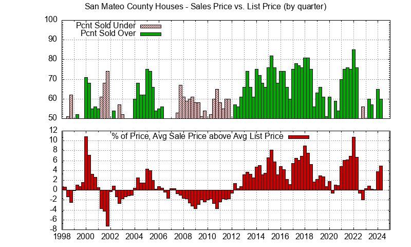
Comparing the San Mateo County house price trends to the Santa Clara County house price trends shows how economic policies can affect areas similarly or differently. Both counties show a year-long price spike beginning in 2000 caused by the dot-com bubble. Similarly both counties show a sharp drop in prices beginning in 2008 due to the mortgage crisis. However Santa Clara County shows a noticeable bump up in 2018 due to buyers wanting to beat an expected interest rate increase while San Mateo County shows only a slight bump up followed by a fairly flat period. Again in 2021, the expected interest rate increases, coupled with fewer sellers due to the Covid pandemic, lead to a noticeable spike upwards this time for both San Mateo County and Santa Clara County.

Most often, house sales prices in Santa Clara County exceed the asking price. This varies with the price range however.
Looking at sales price vs. list price makes changes in the real estate market very easy to see. When sales prices exceed list prices, rising prices generally follow. Homes in expensive areas may mostly sell under list price, but a downward shift in the percentage below sales price indicates falling prices will probably follow.
Table of Median Price Per Sq.Ft. For Silicon Valley Cities
A very simple and quick view of Silicon Valley real estate market trends is available in the table below. The current year's median price per sq.ft., the percent increase so far this year, and the percent increase in each of the previous two years is listed for houses sold for most Silicon Valley cities.
| City | No. Sales | Sq.Ft. Price | 2026 Change | 2025 Change | 2024 Change |
|---|---|---|---|---|---|
| Atherton | 41 | $2,239 | 3.9% | 10.0% | 8.6% |
| Belmont | 91 | $1,366 | 9.9% | -4.8% | 8.6% |
| Brisbane | 13 | $864 | 12.4% | -10.4% | 5.1% |
| Burlingame | 104 | $1,566 | 8.5% | 3.0% | 3.5% |
| Campbell | 81 | $1,220 | -2.3% | 3.0% | 10.1% |
| Cupertino | 98 | $1,662 | -1.3% | 1.6% | 8.7% |
| Daly City | 151 | $848 | 5.3% | -2.4% | 5.4% |
| East Palo Alto | 35 | $797 | -3.7% | 3.5% | -1.3% |
| Foster City | 33 | $1,095 | -3.3% | 1.0% | 6.2% |
| Fremont | 407 | $1,063 | -0.9% | -2.4% | 12.2% |
| Hayward | 252 | $632 | 0.6% | -4.2% | 4.6% |
| Hillsborough | 66 | $1,625 | 8.6% | 4.1% | 5.9% |
| Los Altos | 147 | $1,967 | 3.1% | 2.7% | 8.0% |
| Los Altos Hills | 44 | $1,580 | 0.4% | -0.8% | 6.6% |
| Los Gatos | 170 | $1,364 | 9.9% | -2.3% | 2.7% |
| Menlo Park | 145 | $1,773 | 7.2% | 4.4% | 5.3% |
| Millbrae | 50 | $1,277 | 6.5% | 2.8% | 7.0% |
| Milpitas | 86 | $995 | -1.6% | -4.6% | 15.4% |
| Monte Sereno | 19 | $1,529 | -1.4% | -1.0% | 18.2% |
| Mountain View | 115 | $1,671 | 1.5% | 2.2% | 2.1% |
| Newark | 103 | $871 | 3.0% | -6.9% | 12.2% |
| Pacifica | 111 | $865 | -2.4% | -5.1% | 9.0% |
| Palo Alto | 198 | $2,161 | 7.4% | 4.8% | 6.6% |
| Portola Valley | 30 | $1,573 | -1.0% | 4.2% | 10.6% |
| Redwood City | 222 | $1,348 | 10.9% | -0.9% | 7.3% |
| Redwood Shores | 25 | $1,402 | 12.0% | -4.5% | 21.2% |
| San Bruno | 79 | $1,020 | 4.0% | 2.2% | 3.4% |
| San Carlos | 125 | $1,440 | 0.6% | 5.9% | 9.7% |
| San Jose | 1892 | $997 | 1.3% | -0.7% | 8.6% |
| San Mateo | 247 | $1,331 | 7.6% | 0.7% | 5.7% |
| Santa Clara | 212 | $1,384 | 4.2% | -2.7% | 16.7% |
| Saratoga | 111 | $1,572 | 0.9% | 2.2% | 5.0% |
| South San Francisco | 106 | $887 | -2.4% | 1.2% | 4.9% |
| Sunnyvale | 268 | $1,558 | 1.5% | 1.5% | 10.1% |
| Union City | 114 | $823 | 1.2% | -7.1% | 11.3% |
| Woodside | 38 | $1,546 | 16.1% | 3.2% | 3.8% |
Index Tables
- Real Estate Trends and Just Sold City Index Table
- Real Estate Trends and Just Sold Zip Code Index Table
Understanding Home Values
There are two different things to look at to get an understanding of home values: 1) recent sales, 2) real estate trends.
By looking at recent home sales you can judge the current attitudes of home buyers. By looking at real estate trends you can see how attitudes have shaped homes sales in the past and how they might be changing.
New House Price Trends
JLee Realty now shows Silicon Valley house prices using a plot that makes it easy to see changes in the appreciation rate.

Now consider how two different starting values look. They appear to grow at the same rate.
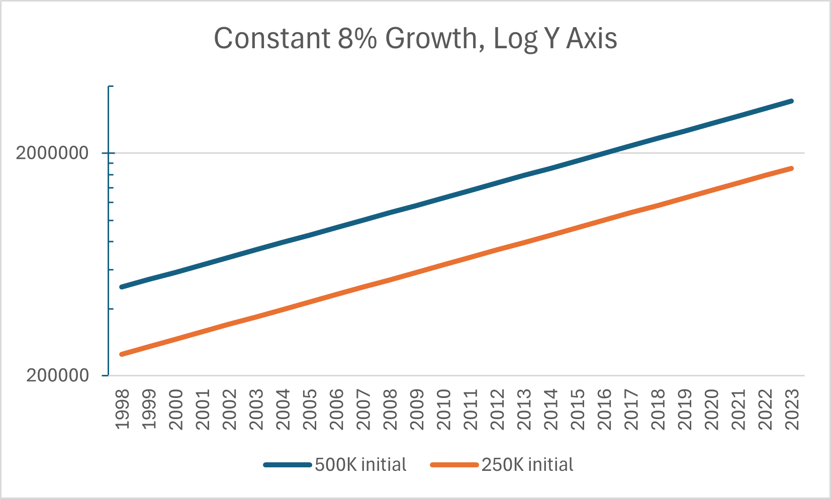
The upper plot runs parallel to the lower plot.
Old House Price Trends
Previously JLee Realty showed house prices using a simple plot that made reading the prices easy but changes in the appreciation rate weren't easy to see.

Now consider how two different starting values look. They appear to grow at different rates.

The larger initial value appears to grow faster. It would be easy to think a more expensive house appreciates faster. However two less expensive houses whose total value equals the more expensive house would have the exact same plot as the single house. Common plots make it look like a more expensive house appreciates faster but it doesn't have a higer growth rate which is typically shown as a percentage increase.
MLS Listings Style Graphs
You will probably see MLS Listings provided graphs during your home search. We use MLS sales records to create our graphs but choose to provide our own insights through our own display of the data. One difference that is not obvious is that we do NOT use a trailing average. For instance if on say July 15 you were to look at our graphs, the last monthly data point plotted would only include July 1 through July 15 closed sales, not the previous 30 days. With closings often taking 30 days, the July data point likely will not include all July sales until about the end of Aug. The last point plotted will change as more sales close escrow. A couple of MLS Listings style graphs, that are regularly updated, are shown below.The MLS Listings style graphs do not show a constant appreciation percentage as a straight line.
FreddieMac Mortgage Rates
Mortgage rates have a profound impact on the affordability of real estate. Rates are heavily influenced by political choices about both the current economy and expectations about the economy in the future. When considering historical and future prices of real estate, you should consider mortgage rates. FreddieMac provides the best historical presentation of mortgage rates. Scroll down in the framed FreddieMac window to see a chart of mortgage rates.
Juliana Lee Team - 650‑857‑1000
Please take a look at choosing a top Silicon Valley real estate agent.
[email protected] - 4260 El Camino Real, Palo Alto, CA
JLee Realty
Broker - Pinnacle Realty Advisors: 02220139 | Juliana Lee Team:70010194
![]()
Silicon Valley Real Estate and Homes For Sale